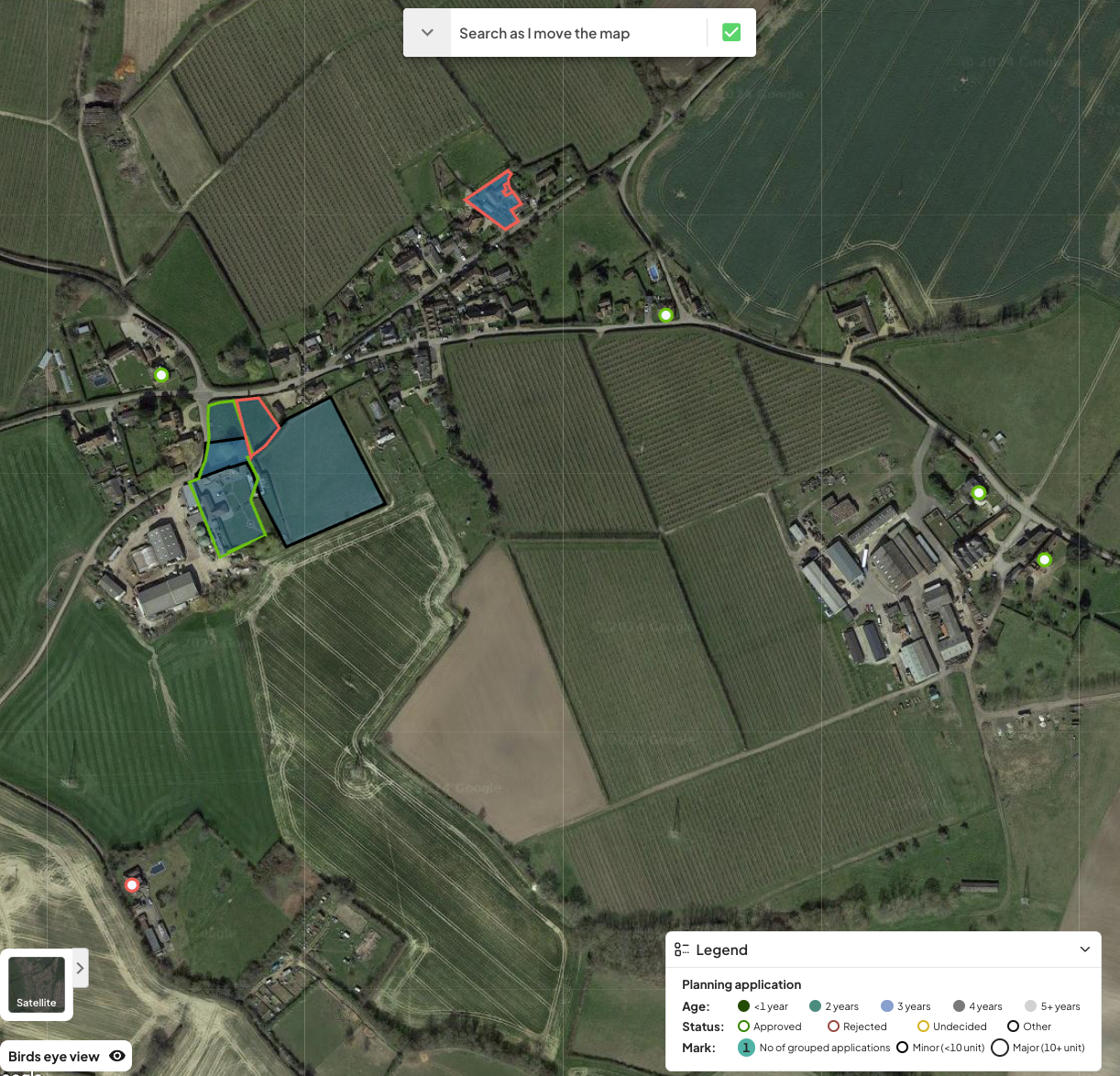
The difference arises from the type of data provided by local councils. Some councils share digital boundary data for planning applications, while others do not. If the application includes a “map” page with a boundary outline, we’ll display it as a polygon. However, if no boundary data is provided, the application will appear as a dot on the map.